
In its Climate Change 2014 Synthesis Report Summary for Policymakers, the Intergovernmental Panel on Climate Change (IPCC) stated:
It is extremely likely that more than half of the observed increase in global average surface temperature from 1951 to 2010 was caused by the anthropogenic increase in greenhouse gas concentrations and other anthropogenic forcings together. (p. 5, emphasis theirs)
In other words, more than half of the warming that has been observed since the mid 1900s has been caused by human activity. How did they arrive at that conclusion? The scientists involved attempted to determine the natural variation in global temperature that would have occurred without human influence, and they found that it accounted for less than half of the observed warming that has been observed. Thus, human activities are responsible for more than half.
The problem, of course, is how do you determine how much warming would have occurred without human activity? The way the IPCC did it was to look at the natural variation that has occurred in the factors that are known to influence the temperature of the planet. One of the biggest factors is how much energy the earth is getting from the sun, which is often called the total solar irradiance (TSI). Well, we have been measuring the TSI with satellites since 1979, and while each satellite comes up with a slightly different value (the reason for that is unknown), all of them agree on how it has varied since they began their measurements.
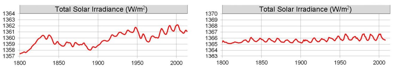
However, in order to properly understand the long-term effect of TSI, we need to go farther back in time than 1979. As a result, observations that should be affected by TSI are used to estimate what it was prior to 1979. These are called “proxies,” and their use is common among scientists who attempt to reconstruct various aspects of the past. Unfortunately, it’s not clear what the best proxies are for TSI, so the details of how it has changed over time varies substantially from one study to another. That’s what I am attempting to illustrate in the figure above. It shows two different graphs for how TSI has changed since the year 1800. Notice the one on the left (from this study) shows that TSI has been quite variable, while the one on the right (from this study) shows it hasn’t varied significantly over the same time period. Both of these studies were published in the peer-reviewed literature, and both use accepted methods for reconstructing TSI from proxies. The difference, of course, is caused by the different preconceptions in each group of scientists. Whose preconceptions are correct? We have no idea.
To demonstrate just how much variation occurs due to these preconceptions, here is a figure from a very interesting study that I somehow missed when it first came out (in 2015). It shows eight different reconstructions of TSI from eight different peer-reviewed studies:
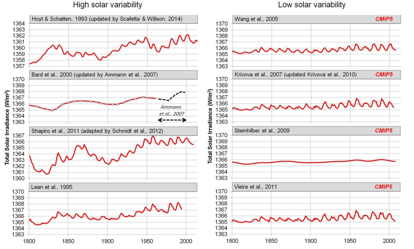
I used the top two graphs to make the illustration that appears at the very top of the post. As you can see, the eight reconstructions are arranged so that the ones which show a high variability in TSI are on the left, and the ones which show a low variability are on the right. What about the “CMIP5” that shows up on low-variability graphs. It indicates that those were the graphs used in the IPCC’s Climate Change 2014 Synthesis Report, which I quoted above.
Think about what that means. The IPCC specifically chose from the scientific literature TSI reconstructions that indicate there has been little variation since 1800. Thus, natural variation in TSI cannot explain much of the variation we see in global temperature. However, if they had used one of the reconstructions on the left, their conclusion would have been much different. In fact, the authors of the study from which those eight graphs were taken showed that if you used the top left reconstruction, you could explain the vast majority of the variation we see in the earth’s temperature. Thus, had the IPCC chosen that reconstruction, their conclusion about the effect of human activities on global warming would have been radically different.
Hopefully, you can see what I am driving at. All eight of the reconstructions above are legitimate, peer-reviewed reconstructions of TSI. If you choose the ones on the right, you reach one conclusion about the extent to which human activities have affected global temperature. If you choose the ones on the left, you come to a completely different conclusion. How do you choose? You choose the ones you think are best. In other words, you choose the ones that fit your preconceptions.
Unfortunately, this inconvenient fact is left out of most discussions of climate change. As a result, most people state what the “science” says, when they are utterly ignorant of how much that “science” depends on the preconceptions of the scientists who produced it.
Thank you for pointing out the variables in these studies. It seems like people on both sides of this issue claim they are right, yet both sides forget to share the truth that their scientific conclusions boil down to which preconception one starts with. It makes it difficult to know who to trust.
You are pointing out that the conclusions of this Climate Change summary is heavily dependent on the set of assumptions chosen, and that there isn’t a clear way to know which assumptions are correct.
I think it is worth further pointing out that this report is intended to drive policy at the highest levels. Their intent is that billions will be spent, laws will be passed, executive orders will be issued, people will be hired and fired, and politicians will rise or fall based on their assumptions. This will affect all of us.
I note with interest Section SPM 3 of this report: “Substantial emissions reductions over the next few decades can reduce climate risks in the 21st century and beyond”. They claim to be taking the long view, to be thinking of the needs of generations yet unborn.
If that is the case, why don’t they discuss the real existential threat that our planet faces, that is not at all in dispute: The coming demographic winter. In the U.S., China, Japan, Europe, and the rest of the “industrial nations”, the fertility rate is already well below the replacement rate. Almost every other country is rapidly heading in that direction. Family values and family creation are in decline. This is a disaster of epic proportions and isn’t getting anywhere near the amount or quality of discussion it deserves.
Thanks