
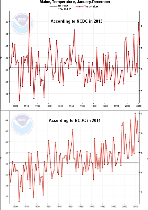
In 2013, certified consultant meteorologist Joseph D’Aleo was putting together a talk and wanted to show a graph that illustrated how the average temperature of the state of Maine had changed over time. He went to the National Oceanic and Atmospheric Administration’s (NOAA) National Climatic Data Center (NCDC) and downloaded the data. As shown in the top graph, the average temperature showed no trend (warming or cooling) for more than 100 years. This year, he was preparing a talk and wanted to update the graph. He went back to NOAA’s NCDC and downloaded the exact same temperature record, including more recent years.
The change was dramatic, as shown in the bottom graph. The data showed a clear warming trend. Was this dramatic changed caused by more recent years added to the new graph? No. It was caused by the old data! Between the times D’Aleo had downloaded the data, the temperatures for some of the previous years had been lowered, and the temperature for some of them had been raised. However, it seems that more of the earlier years were lowered and more of the later years were raised (or lowered less). As a result, the message of the graph had changed remarkably. Where just one year previously, the data showed no warming over the past century, that same data now show a significant warming trend over the exact same time period! As he states:
Does anybody know what the REAL temperature of Maine is/was/is supposed to be? I sure as [**BLEEP**] don’t. I don’t think NCDC really does either.
What caused Mr. D’Aleo to share this experience? It was a revelation that started with Steven Goddard (aka Tony Heller).
In a web post, Mr. Goddard was comparing the NCDC’s “raw” temperature data to their “final” temperature data. What’s the difference between the two? The NCDC has temperature-measuring stations set up all around the U.S. They automatically read the local temperature and send that result to the NCDC’s database. The actual reading that comes from the temperature-measuring station is the “raw” data. The problem with such a system, of course, is that every once in a while, there is a glitch. Sometimes, there is a power outage at a station. Sometimes, there is a communication error. Sometimes, the station is down for maintenance. As a result, there are times when the station doesn’t report any data at all.
What is the NCDC to do about this? If they just left the data blank, that would be a problem, because it would skew the average temperature for that area. As a result, they have a computer code that estimates the temperature that the station would have sent if it had been sending data at the time. This might sound a bit strange, but it makes perfect sense. Missing data would skew average temperatures, so something has to be put in the missing data’s place. An estimate is better than something we know to be wrong. As a result, the NCDC’s “final” data include those estimates.
Goddard wrote a program that went through the database and determined when the NCDC used the actual temperature as measured by the station and when it used an estimate. According to his analysis, before about 1970, roughly 10% of the data used in the “final” data set were estimates. This makes sense. However, as time went on, more and more estimates were used. The percentage of estimates picked up strongly in the 1990s, and currently, about 40% of the data used in NCDC’s “final” data set are estimates. They are not real data. That, of course, is shocking.
There are many people, however, who don’t think Steven Goddard is a reliable source. This is the first I have heard of him, so I have no opinion on that matter. As a result, most people who are interested in the global warming issue didn’t pay his claim much mind. Indeed, some people who are very skeptical of the current global warming hysteria (like Anthony Watts) dismissed Goddard’s claims. However, it didn’t take much time for people to figure out that he is, in fact, onto something.
Paul Homewood, for example, checked the temperature record for Luling, Texas (the top weather station on NCDC’s list). He showed that there is definitely a problem. There were far too many times estimates were used, and they tended to make the average temperature artificially high. He found similar problems for the stations in the state of Kansas. Whether or not Goddard’s analysis is completely correct, something is clearly going on. There are at least two states (Kansas and Maine) as well as one specific temperature-measuring station (Luling, Texas) where way too much estimated data are being used, and it seems to skew the trends to show artificial warming.
Judith Curry, who I consider to be one of the most reasonable voices in the climate change discussion, has an excellent post on this. She says that Goddard has clearly made some analysis errors, but his overall message is correct – something is wrong with the NCDC’s “final” data. She also made two very important statements that I think are worth repeating.
Her first statement is in regards to the fact that even those who are skeptical of global warming hysteria initially dismissed Goddard’s claim, because they considered him an unreliable source. Indeed, Anthony Watts initially posted that Goddard was wrong. However, because others (like Paul Homewood) did more digging, Watts eventually admitted that his initial reaction had been too hasty. Now it seems that most people who have looked at the data agree that something is dreadfully wrong. As Curry points out:
…the main point is that this group is rapidly self-correcting – the self-correcting function in the skeptical technical blogosphere seems to be more effective (and certainly faster) than for establishment climate science.
Curry should know. She was a part of the “establishment climate science” for a long time and is now a part of the skeptical technical blogosphere. The other statement is more to the point. Here is what she wrote:
This incident is another one that challenges traditional notions of expertise. From a recent speech by President Obama:
“I mean, I’m not a scientist either, but I’ve got this guy, John Holdren, he’s a scientist,” Obama added to laughter. “I’ve got a bunch of scientists at NASA and I’ve got a bunch of scientists at EPA.”
Who all rely on the data prepared by his bunch of scientists at NOAA.
Based on the fact that there is something wrong with the NOAA’s NCDC “final” data, this could be a real problem.
So why don’t they have a double system? The data transmitted and another set that is a hard copy kept onsite? Then when there is a problem with the transmitted data, they can fill in with actual data instead of an estimate.
They sort of have that already, Patti. The “raw” data are kept, so it’s not like that’s being thrown away. The problem is that the majority of scientists don’t want to deal with the missing data. They trust the NCDC to do that properly, so they just use the NCDC’s “final” data. It seems that’s not the responsible thing to do now.
Great article! As an engineer, I see bad data as the source of all kinds of problems, so this is no surprise. Anytime I see “adjusted” or “estimated” data, alarms go off as it’s very hard to adjust data without introducing factors that go in your favor. I don’t know how many times I have accidentally “fudged” test data to get the results I want. But, as an engineer that needs to ultimately measure voltages and frequencies, my fudging always finds me out.
It doesn’t get any simpler than this. Electronically read some thermometers and record the results. If there are problems with this data, you can imagine how questionable data from tree-rings, coral growth, and other more complex methods are. Every reading using those techniques was done by a flawed human being with a bias either toward proving or disproving global warming.
Like I said, it’s really hard to adjust data without introducing your biases.
That’s an excellent point, Kyle. As soon as you start manipulating the data, you tend to bias it!
Well, this is quite a gem. So they’ll go even as low as fake data to support their ridiculous Climate Change hysteria. I can’t wait for more studying to be done on this, I’m curious how much of that graph is actually empirical, and not a pack of biased lies. Did this information catch you off guard, Dr. Wile, or did you anticipate it?
I am not sure they are faking data just to get the result they want, Zorcey. I think Kyle’s point is more correct – they felt like they had to manipulate the data, just to take care of the blank temperatures. The problem is, that manipulation ended up being fed by their preconceptions. This information did catch me totally off guard. I simply assumed, as most scientists did, that the NCDC final data could be trusted.
You ask how much of the data are empirical. It’s not clear. I can say this, though. The U.S. Climate Reference Network (USCRN) has fewer stations, but they are scattered rather evenly across the U.S. Because there are fewer stations, they can monitor them manually, so there is no need for “adjustments.” They have only been measuring data like this since 2005, and since that time, they show a slight cooling trend for the contiguous U.S..
The reason I decided (I suppose somewhat hastily) to apply the term ‘fake’ was because of the fact that I have read articles by you – and by other scientists – that have pointed out the great discrepancies in the models all these climate estimations come from, and the actual change we see in nature. I’ve also read about how those behind these faulty models are in no rush to correct them.
I admit ‘fake’ was a tad strong, but I do think it is at least somewhat applicable, as they weren’t really truthful data, though were implied as such. In my opinion, when conducting a science experiment, one should be extremely careful when dealing with estimations, and should never allow the public to fall into thinking they were actually observed values.
I understand the need to estimate data in order to compute an average temperature for a specific time and region, but once you have that computation, why does it need to be adjusted later? What new data could turn up in 2014 that would call for the adjustment of data from 1914?
Whatever the reason may be, if old measurements need to be adjusted, then I would expect that on average the number of measurements increased would be roughly equal the measurements decreased, wouldn’t they? That’s certainly not the case in the new 2014 graph- which makes it difficult to see the graph as the result of objective adjustments.
Keith, I suspect the algorithm that computes the estimations was changed. The algorithm is run on all temperatures, so when the algorithm changed, all the estimates changed as well. I also suspect that the algorithm has something to do with the readings of nearby stations, etc. As a result, I wouldn’t expect it to act the same on all the data.
My first reaction to reading this was, “WOW!”
Secondly… How can scientists bear with this terrible data; 40% “missing” data is an enormous amount! I think they need to hire some new engineers for their network.
Despite this, you’d think that getting this “estimate” wouldn’t be that hard to get. For example, if they had NO idea what the temperature was, why couldn’t they just make a linear line between the missing data…? Is that too simple?
I’ve always been skeptical of people who say these organizations have an “agenda,” honestly, I’d have to physically see it to believe it; they may have a bias or incentive to please the media but that’s different. Nonetheless, it’s very suspicious, just from reading this article, that the amount of data missing has increased… Dramatically. THAT SHOULDN’T HAPPEN. Don’t have a backup? or non-volatile memory? If i had the time i’d love to look into this in detail, unfortunately i don’t have the time, and honestly i doubt anyone would listen.
James, it’s not clear the 40% number is correct. That’s Goddard’s number, and those who have looked at the data in depth think that Goddard’s analysis isn’t quite right. Nevertheless, they all seem to agree that there are too many estimates. I suspect that a linear line between missing data is considered by the NCDC to be too simple. Most likely, the algorithm that computes the estimates is horribly complex, which is why all sorts of crazy things can happen. They do have backups in the sense that the “raw” data is still available. However, if there is a blank in the “raw” data, there is no measurement for that time period.
Hi Dr. Wile,
Thanks for the great post! I just noticed that on the average temperature on the 2013 version is different than that of the 2014 version.
On the heading for the 2013 graph, it says that the average temperature from 1901-2000 is 41.2 degrees.
On the 2014 graph, there is no heading, but the bar representing the average temperature is ~40.1 degrees.
So, could it be that the year range was expanded, which changed the average temperature? Or, could the “estimations” talked about in the post have resulted in a lower average to make the more recent data appear to have higher temperatures?
Thank you for keeping us all updated on what’s going on out there. My brother and I always enjoy reading your posts!
Janson, the lack of headings on the 2014 graph is my fault. I tried to combine the graphs to make them easier to compare. If you go back to the link where I quote D’Aleo (scroll down to just above the comments), you will see both graphs, and they both have headings. Notice that the average is computed using temperatures from 1901-2000. Thus, the additional new temperatures could not affect the average, as they are past the year 2000. Of course, more than the average has changed. Notice that the year 1913 stands out in the top graph as really warm. However, in the bottom graph, it has been lowered so much that it doesn’t stand out anymore. Two dots away from that (1915) didn’t change nearly as much. It is higher than average in both graphs. Had it been cooled as much as 1913, it would be lower than average. So something funky is clearly going on here.
That would be a problem if the only thing thats changing would be temprature. unfortunatly its Climate thats changing.
Yes, have one, climate is changing, as it has been since the earth was formed. The issue is whether or not carbon dioxide accumulation in the atmosphere is artificially warming the planet, as the global warming alarmists claim.
Some good news from back in the old country: Australia just repealed its hated carbon tax. This was introduced by the previous Labor government despite their explicit promise not to. Good Australian non-christian conservative journalist Andrew Bolt writes:
There are many different types of algorithms that can be used to give estimates for missing data. I have, in the past, developed systems that required using available data to create a set of predictive data points. In all cases, when actual data came in for those points, the system was rerun to determine what the new algorithm should be.
It was fairly processing intensive as each set of data was put through a number of curve fitting algorithms to determine the appropriate constants to be used.
I have also had to rebuild systems that had been developed by others, where they did not take into account a variety of complicating factors. From my point of view, they had taken the easy way out or did not do enough research into the area before coding the algorithms required.
It is easy to make simple mistakes that dramatically alter the outcomes. The strange thing is that quite often these outcomes are treated as being correct even though there appears to be something “Not Quite Right” with the results.
After many decades, one has come to the conclusion that one must be sceptical about calculated data points and averages and any system that produces them.