Microscopic Analysis of Dinosaur Soft Tissue Casts More Doubt on Proposed Preservation Mechanism

The dark mass near the center is the cell body of a dinosaur bone cell. The various “arms” extending from the body are its filipodial extensions. (click for credit)
I have written a lot about soft tissue found in dinosaur fossils and other fossils that are supposed to be millions of years old (see here, here, here, here, here, and here, for example). Right now, the best work being done on this issue comes from the Dinosaur Soft Tissue Research Institute, which is run by microscopist and young-earth creationist Mark Armitage. Without the help of government grants, he and his colleagues have produced some truly incredible work. Their latest contribution was published in Microscopy Today, and it strengthens the case that these fossils cannot be millions of years old. As always, I encourage you to read the article in its entirety, but here is my “color commentary.”

First, the article shows more incredible, delicate structures that would not be expected to survive any preservation process that would protect them for millions of years. For the first time in the scientific literature, there are two excellent pictures of dinosaur vein valves (Figures 2 and 3), features that are so delicate they are hard to extract from animals that have just recently died. In another first, he shows a nerve from the same fossil (Figure 6). In that nerve, you can see the delicate Bands of Fontana, structures that are unique to nerves.

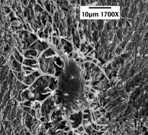
He also shows a bone cell from the same fossil (Figure 7). While bone cells from dinosaur fossils have been published in the scientific literature, this particular one is very important. Bone cells have characteristic structures called filipodial extensions that are remarkably thin (widths of less than 200 billionths of a meter). The bone cell shown in their study has a filipodial extension that is 24 millionths of a meter long. That doesn’t sound like much, but it is about 30% longer than any other dinosaur filipodial extension found in the literature. This is important, because its length is more than 100 times its width. Think about a structure with those dimensions made out of soft tissue. It would be ridiculously fragile, yet there it is in a dinosaur fossil!

Second, and more importantly, he shows that the current explanation evolutionists have for the preservation of soft tissue in dinosaur fossils doesn’t work. Dr. Mary Schweitzer was the first to give strong evidence for the existence of soft tissue in dinosaur fossils, but she is committed to an evolutionary view. As a result, she needs to find an explanation for how such tissue could survive for millions of years. Seven years ago, she published a study in which she hoped to show that iron from the blood of a dinosaur could produce certain reactions that would preserve the tissues. I wrote about her explanation at the time and how it didn’t seem to make sense based on what we knew. Later on, better chemists than I wrote a detailed analysis about how her explanation is inconsistent with the data.

This new paper demonstrates rather conclusively that Schweitzer’s explanation doesn’t work for the fossil being discussed. Armitage and his colleague (Jim Solliday) search the filipodial extensions of bone cells that are found right outside a canal that held a blood vessel. Since the cells are so close to what was a blood vessel, and since the filipodial extensions are so delicate, those iron-induced reactions should produce noticeable effects on the filipodial extensions. He shows that those effects are not present. Thus, it is unlikely that such reactions happened at all in the fossil.

Also, in her study, Schweitzer took great pains to prevent blood clotting so that iron from the blood could be distributed throughout the soft tissue she was trying to preserve. However, Armitage and Solliday present strong evidence for massive blood clotting in their fossil. This would prevent iron from being able to promote any tissue-preserving reactions. While their evidence is strong, however, it is not conclusive. Thus, as they suggest, more research needs to be done.

The Dinosaur Soft Tissue Research Institute is on the forefront of this issue in science, and they are doing it without the massive government grants available to organizations who are desperately trying to fit the data into an evolutionary framework. If you have the means, I suggest that you make a donation to keep science progressing in this area.

A Journey from Judaism to Atheism to Christianity

Dr. Larry Kramer, PhD.
If you have been reading my blog for a while, you know that I collect stories of atheists who became Christians. This one is very interesting to me for two reasons. First, I know Dr. Kramer personally. He and I met several years ago at a conference that we both attend regularly. He was familiar with my books, so he introduced himself to me. I got to know both him and his wife, and we became friends. I always look forward to seeing them at the conference. Second, as the title indicates, atheism was more of a “transition point” on his journey. I have encouraged him to write about this for some time, and I am thrilled that he has. I hope you enjoy reading it:

My Journey from Judaism to Atheism to Faith

Regardless of What You Have Heard, the COVID-19 Deaths in the U.S. are Real

The purple bars are the deaths in the U.S. each week since2017. The yellow line represents the maximum number of deaths that were projected for those weeks. (graph by The Conversation, data from the CDC)

I have referenced this article in some comments I made previously, but I want to highlight it in a separate post, because the graph it contains (also shown above) makes it clear that the COVID-19 deaths are not some manipulation of the data. They are real. Very real. The purple bars in the graph represent all deaths recorded in the U.S. each week since 2017. The yellow line represents a projection of the maximum number of deaths that should have happened each week. The projection is based on historical data, and it fluctuates with the season. That’s because there are usually more deaths in the winter and fewer deaths in the summer, and as you can see, the actual deaths show that same fluctuation.

Notice that for most weeks, the actual deaths were lower than the maximum number of projected deaths. That’s expected. If the projection is done well, there should rarely be a time when the actual number of deaths meets or exceeds the maximum projection. However, there were some weeks in December of 2017 and January of 2018 when that happened, because there was a particularly virulent strain of the flu that season. As a result, more people died than were expected.

But those excess deaths are dwarfed by the ones that start showing up the last week of March in 2020. In that week, about 4,000 more than the maximum projected deaths occurred. Since then, the actual deaths have exceeded the maximum projected deaths by a considerable margin every week. All of this is discussed in the article from which I took the graph. However, I want to make a couple of additional points.

First, look at the shape of the excess deaths. There appear to be two peaks – one very large one the second week of April, and a smaller one at the end of July. This is important, because it looks very, very similar to the COVID-19 deaths reported over the same time span:

When the excess deaths have essentially the same time profile as the COVID-19 deaths, you know that the COVID-19 deaths make up most of the excess deaths. This tells us that the vast majority of COVID-19 deaths are real and most certainly represent people who would not have died had there not been the COVID-19 pandemic.

Second, some friends have asked me why they don’t know anyone who got the disease or died from it. After all, if there really have been more than 180,000 people who died from the disease and more than 6 million confirmed cases, shouldn’t everyone know someone who has suffered from it? Of course not! There are 328.2 million people who live in the U.S. That means about 2% of the population has contracted COVID-19, and about 0.05% have died from it. Thus, your chance of knowing someone who died from it is ridiculously low. While your chance of knowing someone who contracted it but didn’t die from it is significantly higher, remember that for most cases, the disease is mild. Thus, you would have to know someone well enough that you track his or her common illnesses to be aware that he or she had the disease!

It disturbs me that there are so many people (many of whom are Christians) who think this pandemic has been made up. The data clearly say that it hasn’t been. Lots of people died because of the disease, and misinformation will only increase the number of deaths. Now please understand that I am not saying that I support any of the measures that governments have taken to slow the spread. We don’t know enough about the disease or the consequences of the actions that have been taken to know whether or not they are a good idea. I said this before, and I will say it again:

As a scientist, let me assure you that no one really knows what we should be doing. There are a lot of experts saying a lot of different things, and you should listen to all of them. Then, you should decide what works best for you and your family, and you should start doing it. But once you decide what you and your family should be doing, please please please show grace to those who choose to do something different. Since the experts can’t agree on a proper course of action, there is no reason to expect your neighbor to agree with your course of action.

In addition to showing grace to others, please please please stop spreading the false idea that the COVID-19 deaths are few in number or not real at all. They are real, and there are a huge number of them. There is simply no other way to understand the data.