Dark Oxygen

Polymetallic nodules at the bottom of the ocean

From a young age, students are taught that photosynthesis uses sunlight, carbon dioxide, and water to produce oxygen. On land, photosynthesis is carried out by plants, while in water, it is carried out by various single-celled organisms as well as by multicellular algae. Although there are some other natural processes that produce oxygen (such as the breakdown of ozone by ultraviolet rays), the amount produced is so small that it has no relevance to biological organisms. Thus, photosynthesis produces the vast majority of all oxygen on the planet. At least, that’s what we thought! Now thanks to a study by a multinational group of scientists, we know that there is at least one other natural process that produces a significant amount of oxygen, and it happens on the sea floor.

The story starts in 2013, when the researchers were studying an area of the Pacific Ocean called the Clarion-Clipperton Zone. It spans depths of 12,000 to 18,000 feet, so there is no natural light that reaches it. However, there are many polymetallic nodules that contain important metals like copper, nickel, cobalt, etc. As a result, there are those who would like to mine the nodules to collect those metals.

The scientists were studying the area by dropping a contraption onto the sea floor that pushes a cylinder down into the sediments so as to isolate a section of the water. The cylinder has instruments to measure different aspects of what’s going on in this isolated area, including the oxygen level. Since there is no natural light down there, no photosynthesis can take place. However, there are organisms at those depths that use oxygen. It has always been thought that this oxygen is brought down from shallow waters by ocean currents. Thus, the scientists expected the oxygen levels within the isolated area to decrease, which is what happens in most experiments like this one. However, in this experiment, they saw the oxygen levels rise. Since that didn’t make sense, they wrote it off as a malfunctioning oxygen sensor.

In 2021 and 2022, more studies were done, and once again, oxygen levels were seen to rise. Thus, they decided it probably wasn’t a problem with the oxygen sensors. They confirmed the rise in oxygen with another method, and concluded that there must be some process that is actually generating oxygen. Since the polymetallic nodules had a small electrical potential (0.95 volts), they thought that perhaps electricity from the nodules is breaking down water into hydrogen and oxygen. However, it actually takes 1.5 volts for that to happen, so they thought that perhaps the potentials could add together in roughly the same way voltages add when you string batteries together in series.

They decided to recreate the situation in a small lab on the ship, using sediments and nodules from the seafloor. They found that oxygen would be produced in the lab for a while, but then production would stop. This implies that there is a power source on the seafloor that keeps the process going.

But is this a significant source of oxygen? Yes! In the isolated cylinders, for example, oxygen concentration rose to a level that is higher than what is typically found in surface waters, where all sorts of photosynthesis is going on. In the end, then, it’s possible that deep-sea organisms are not just using oxygen that is transported down from the surface. Instead, there might be a plentiful supply of oxygen being generated for them on parts of the sea floor!

This is not only an exciting discovery that might end up overturning scientific “facts” that have been taught for generations, but it also a reminder of what happens when you allow your preconceptions to color the science you are doing. Remember, these researchers first saw this source of oxygen 11 years ago, but they wrote it off as an error, since the production of oxygen on the dark seafloor was considered “impossible.” It’s very hard for scientists to rid themselves of preconceptions, but for science to advance, we must continue to try.


Pictures and a Video from the Total Eclipse

The area where I live had a great view of Monday’s total solar eclipse. As a result, I was able to simply watch the event from my backyard. We had some friends and family over to join in the fun, and it was a great afternoon. Before showing you the images and video I shot, however, I want to show you a great picture taken by a student in my Memoria College course, Bryan Henslee. He was also in the path of totality, but he was in Texas. Here is his shot of the total eclipse:

The moon has blocked off most of the sun, but you do see its atmosphere (the corona). The pink colors are from solar prominences, which are loops of the sun’s plasma that rise from the surface but stay connected to the sun.

None of my images are nearly as remarkable as that one. I did set up a digital video camera, and here is a video of before and after the total eclipse, which is sped up by a factor of 10:

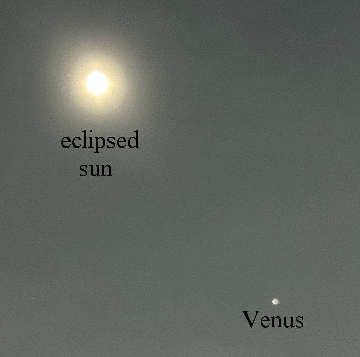
The camera doesn’t do well with the glare, so it’s hard to see the moon. If you look closely, however, once the ball of light gets small, you can see a dim disc inside it. That’s the moon. The small dot you see below and to the right of the sun is Venus. My daughter (Dawn Perdue) got a great shot of it:

While everyone was equipped with eclipse goggles, I also set up a binocular projector that allowed people to see the eclipse indirectly:

The binoculars projected an image of the sun onto the white sheet, and that image showed the first moments of the eclipse really well:

It then produced these images as the eclipse progressed:

The colors are caused by glare and the lens, so once the moon came close to completely covering the sun, looking at the eclipse through the glasses was better.

One of the people who was with us had traveled from Virginia to see the eclipse. He had experienced one total eclipse before, and he enjoyed it so much he wanted to see another. I am not sure I enjoyed it as much as he did, but if I make it to 2045, I will watch the next total eclipse that passes through a large portion of the U.S. from my rocking chair.

“Silent” Mutations Might Require “Re-examination of Numerous Biological Conclusions”

A recent study on yeast indicates that mutations which do not lead to a change in the protein produced are not silent after all.

Genetic mutations are important. They can result in genetic diseases, and those who fervently believe in evolution as a creation myth think that they can be a source of novel genetic information, despite the fact that the balance of the scientific evidence shows it is not possible. However, there is one kind of mutation that has long been assumed to be “silent”: the kind that doesn’t change the protein produced by the mutated gene. To understand the reasoning behind this assumption, you need to know a bit about molecular genetics.

A gene is a stretch of DNA that gives the cell a “recipe” for making a molecule. Often, that molecule is a protein. A protein is a large molecule formed when many smaller molecules, called amino acids, are linked together in a very precise way. DNA tells the cell how to make a protein by listing the amino acids needed and the order in which they should be linked. It does this using a code, called the genetic code.

There are four chemical units in DNA called nucleotide bases, and they are represented by the letters A, C, G, and T. When put in groups of three, those letters specify a particular amino acid. For example, the sequence CTC specifies one amino acid, while the sequence CAC specifies a completely different amino acid. A gene, then, can be represented by a string of letters that, when grouped three at at time, specify a bunch of amino acids in a specific order. The cell “reads” that sequence and then puts those amino acids together in that order, and the result is the protein that the gene specifies.

The most common mutation that can occur in DNA is a point mutation, where one of those letters changes. For example, consider the two sequences I just gave. If DNA has the sequence CTC in it, but a point mutation changes the “T” to an “A,” it now has CAC in it. As a result, the protein produced by the gene now has the wrong amino acid in it. In fact, this is what causes sickle-cell anemia. If the gene that tells the cell how to make hemoglobin (the protein that carries oxygen in the blood) experiences that mutation, the protein produced is no longer correct, which leads to health problems.

But the genetic code is redundant, which means there are multiple sequences that code for the same amino acid. For example, CTC and CTT both specify the same amino acid. So, if the gene for hemoglobin experiences a point mutation that turns CTC into CTT, the amino acid specified doesn’t change. What should happen as a result? Nothing. After all, the whole problem in sickle-cell anemia is that a point mutation turning CTC into CAC means the protein was made with the wrong amino acid. A point mutation that turns CTC into CTT shouldn’t result in any ill effects, because the protein produced has the correct amino acid in it. Thus, it has always been thought that these kinds of mutations are harmless, since they don’t affect the protein being made.

As a point of terminology, this kind of mutation is called a synonymous mutation, because while the sequence of letters in DNA has been changed, the end result (the protein produced) is the same. Thus, it has long been thought that synonymous mutations are harmless. As a result, they are often called silent mutations or neutral mutations, since they shouldn’t be noticeable when it comes to the functioning of the organism that carries the mutation.

Well, scientists from the University of Michigan and Stanford University decided to test this idea, and they found it to be false in most cases. They used a genetic editing tool called CRISPR to make a bunch of mutant yeast cells. Each cell had a point mutation in an important gene. Many of those point mutations were synonymous. They then measured how quickly the yeast cells could reproduce. They found that 75.9% of the mutants with synonymous mutations were slower to reproduce than the yeast that had no mutations at all. In other words, the vast majority of synonymous mutations were not neutral! Instead, they actually caused the yeast to reproduce more slowly.

Now, of course, this study used only yeast. We don’t know for sure that its conclusion is true for all organisms. However, if these results are demonstrated for other organisms, the implications are incredible. Indeed, the authors state:

The strong non-neutrality of most synonymous mutations, if it holds true for other genes and in other organisms, would require re-examination of numerous biological conclusions about mutation, selection, effective population size, divergence time and disease mechanisms that rely on the assumption that synonymous mutations are neutral.

One thing that comes to my mind immediately is Dr. John Sanford’s work on genetic entropy. He has demonstrated that natural selection is not very efficient at weeding out mutations which reduce the information content in the genome. As a result, genomes decay over time. If it turns out that even synonymous mutations reduce the information content of the genome, it could mean that genomes decay even more quickly than Dr. Sanford has suggested.

I’m BAAAAACK!!!!!!!!!

Did you miss me? I know some people did. I received a few messages from readers, asking why I have been so quiet lately. Well…I have just been insanely busy. A biology professor, Dr. Paul Madtes Jr, and I have been writing a new high school biology text. While writing with him has been an incredibly rewarding experience, it took a lot of time. In addition, I taught a Master’s Class at Memoria College this year, and it was pretty challenging. We read the great natural philosophers of the past and discussed how their work shaped modern science.

Now things are winding down on both fronts. The book has been sent to the printer, and this week is the final week of the Master’s class. As a result, I can now return to blogging. Tomorrow, I will post an article discussing our new biology course and how it is different from Exploring Creation with Biology, 2nd Edition, which the publisher allowed to go out of print. For now, if you want a preview of what it looks like, you can go here:

Discovering Design with Biology by Dr. Paul Madtes Jr and Dr. Jay L. Wile

If you click on “Product Resources,” you will find a table of contents, the entire first chapter, a scope and sequence, and the details about the experiments.

Total U.S. Deaths Over The Past 7 Years and COVID-19

Over the past few weeks, I have gotten some emails regarding COVID-19 that were filled with misinformation. In an attempt to clear up this misinformation, I thought I would look at some data that are rather easy to obtain and analyze: total deaths in the U.S. over the past seven years and the deaths attributed to COVID-19. They come from the CDC, which I know many of my readers don’t trust. Indeed, I don’t trust the CDC when it comes to many of their recommendations, including some related to COVID-19. Nevertheless, these data are rather hard to manipulate, since they come from many independent sources. Thus, while they might not be 100% accurate, the overall conclusions we can draw from them should be reliable.

Looking at the above graph, then, what do we see? Let’s start with the total deaths (in blue). They follow a familiar pattern in the five years leading up to 2020. They peak in January, trail off in the summer, and start rising again in autumn. The peaks are generally attributed to two things: cold weather is more deadly than warm weather, and the influenza season typically peaks in January/February. Indeed, if you look at the heights of the peaks in the years before 2020, you can see when the more severe influenza seasons were: 2015 and 2018.

Notice, however, that 2020 and 2021 break the pattern established in the previous years. The peak in 2020 is much, much higher than the peaks in the previous years, and it comes later in the year (mid-April). In addition, when it comes back down to its minimum (late June), it is much, much higher than the minimum of any other year. Then, there is a bump that occurs later in the year, followed by another peak that is even higher than the one in April of 2020. Clearly, this tells us something unusual happened in 2020, and it is still happening in 2021.

Of course, we know what that unusual situation is: COVID-19. If we graph just the deaths attributed to COVID-19 (in orange), you see the same unusual pattern: a peak that occurs in April of 2020, another bump, and then an even larger peak. Just to see how much of this unusual pattern can be attributed to the COVID-19 deaths, the gray line shows you what happens when you take the total deaths and subtract the COVID-19 deaths. The result is something that looks a lot more like the pattern that was established in the past seven years. However, the pattern isn’t exactly the same as what is seen in the previous years. Notice that the gray line never gets as low as the blue line does in 2014-2019. Thus, even after subtracting out the COVID-19 deaths, there are still more deaths than in the previous years.

What does all this mean? Well, let’s start with two things we can say for certain. First, contrary to what you may have heard (and what I was sent in email), COVID-19 is NOT just a severe flu-like disease. It is responsible for more deaths than any flu in the past seven years. Indeed, the only influenza that was more deadly than COVID-19 in the U.S. (as of right now, anyway) was the 1918 Spanish flu. Second, COVID-19 deaths are not being significantly over-reported. If that were the case, subtracting out the COVID-19 deaths would have resulted in fewer deaths than in previous years (the gray line would have dipped lower than the blue line dips in previous years).

What can we say about the fact that even after subtracting out the COVID-19 deaths, there are still more deaths in 2020 and 2021 than the previous years? As I see it, there are two possibilities. It’s possible that COVID-19 deaths are being under-reported. It’s also possible that the COVID-19 measures that have been instituted have produced some deaths as well. I think the second option is more likely. Social isolation, delaying doctor appointments, etc., will result in more deaths. However, the number of those deaths is small compared to the COVID-19 deaths.

There is one more thing that I see in the data, but it is preliminary at best. Notice that the peak occurred much sooner this year than last. While the peak number of deaths in 2020 occurred in April, this year’s peak occurred in January. Assuming the virus hasn’t changed substantially over the past year, that means something happened to curtail COVID-19 deaths. What happened between 2020 and 2021? The vaccine started rolling out. The first doses were given in December of 2020, and the initial focus was on health care providers and those who are most at risk of dying from COVID-19. To me, it isn’t surprising that this produced enough of a slowdown in COVID-19 to cut the peak back three months. Once again, that is a preliminary conclusion which could be wrong. However, I do think that time will bear it out to be true. Regardless, I will post a similar analysis in a few months to see what the data say then.

Sweden’s COVID-19 Strategy Didn’t Work

A comparison of Sweden and Denmark in terms of COVID-19 (click for higher resolution)

I have written two posts comparing the COVID-19 situation in Sweden and Denmark (see here and here). I find the comparison useful, because they are very similar countries in the same basic region of the world, but they had remarkably different responses to the disease. Sweden initially avoided lockdowns and tried to target their social restrictions, while Denmark followed the practices of most other countries, strongly limiting what their citizens could do during the pandemic. Sweden thought that if they allowed the disease to run its course among those who are not at high risk, they would achieve herd immunity, and the disease would lose its impact. As a result, they tried to target their severe restrictions to those who were at high risk, allowing the rest of the population to live life more normally.

By fall, there were those who thought the strategy had worked. Case rates were falling, and Sweden seemed to have weathered the storm. However, in my August post, I said that Sweden had not reached herd immunity, and it turns out that I was right. If you look at the above graphs (data from the European Centre for Disease Prevention and Control), you will see that while both Sweden and Denmark saw a leveling off in the summer and early fall, COVID cases and deaths quickly shot up later on. To date, Sweden’s COVID-19 deaths per million are more than three times that of Denmark’s, and right now, there is no indication that either country will see a slowdown in cases or deaths, at least not until the vaccines are widely distributed.

Now please understand that comparing two different countries is fraught with peril, and even though Sweden and Denmark are similar in many ways, we cannot use these data to definitively say that government-imposed lockdowns are responsible for the difference. Indeed, there is a fairly recent study that tries to compare different countries, and they conclude that while some social restrictions did reduce the spread of the disease, severe restrictions (like lockdowns) didn’t help at all. Interestingly enough, they use Sweden as part of their baseline for countries that didn’t implement severe restrictions, but they do not use data from Denmark in any way. I personally think their analysis uses countries that are just too different to be compared in any meaningful way.

To show you what I mean, I added the U.S. and Italy to the graphs above to show you where they fit.

Notice that while the general shape of Italy’s death graph is similar to that of Sweden and Denmark, the U.S. deaths look very different. Conversely, when it comes to cases, the U.S. graph has the general shape of Sweden and Denmark, while Italy is different. Finally, notice that the total number of deaths per million varies by nearly a factor of five, despite the fact that three of the four countries on the graph had strict limitations on what many of their citizens could do.

I think there is one firm conclusion we can make from the data presented above: Sweden’s strategy of trying to control the disease using herd immunity acquired through exposure did not work.

C.S. Lewis Never Said That

Perhaps it’s the academic in me, but I am always bothered when I see a quote attributed to someone who never said or wrote it. The situation becomes even more frustrating when it is someone whose work I know well. I was scrolling through my Facebook feed this morning and saw the following:

You do not have a soul.
You are a soul.
You have a body.
-C.S. Lewis

While I appreciate the thought, it was not something C.S. Lewis ever wrote, and I can’t find any record of anyone saying that he heard Lewis say that. In fact, the phrase was written several years before Lewis was born.

It can be found in a magazine called The British Friend, which was an important publication among Quakers in the United Kingdom. The author is discussing the way a Quaker should mourn the death of a loved one. To emphasize that the body is a temporary vessel but the soul is eternal, he states:1

“Never tell a child,” said George Macdonald, “you have a soul. Teach him, you are a soul; you have a body.” As we learn to think of things always in this order, that the body is but the temporary clothing of the soul, our views of death and the unbefittingness of customary mourning will approximate to those of Friends of earlier generations.

Since the author attributes this quote to George Macdonald, a minister Lewis respected and admired, you might say that perhaps C.S. Lewis said this in a lecture, quoting George Macdonald. That could be true, but I seriously doubt the Oxford Don would do that without giving proper attribution!

REFERENCE

1. W. H. F. A., “Be Not Entangled Again in a Yoke of Bondage,” The British Friend July 5, 1892, p. 157.
Return to Text

A Life Dedicated to Love

Ellen Irene Parran, who passed into her Savior’s arms on May 27, 2020. She was 91.
I meet a lot of different people. Some of them are fans, and they offer me high praise. Some of them are definitely not fans, and they offer me insults. Some of them share common interests with me, and they support me in those interests. Many of them are brothers and sisters in Christ, and they offer me love. I am sure that the vast majority of those brothers and sisters are sincere in their offer, but every once in a while, I meet a brother or sister who actually demonstrates the love of Christ to me. One of those sisters was Ellen Irene Parran. While she is now gone from this world, it will continue to be a better place because of her effect on it.

I met Sister Parran (who quickly became Mother Parran to me) because I spoke at the Creation Evidence Expo, which was organized by her son-in-law, Pastor Fredrick Boyd, Jr. of Zion Unity Baptist Church. I am sure I was introduced to her earlier, but my first memory of her was something that happened at a dinner she had prepared for the speakers. The ribs she made were the best I had ever eaten, and I went over to her and told her that. She smiled and told me that she was happy I liked them, and I turned around to go back to where I was sitting. However, she gently grabbed my shoulders, turned me around, looked me straight in my eyes, and said:

I love you Dr. Jay. Don’t you ever forget that.

It’s easy for someone to say those words, and it’s easy for me to hear them and quickly forget them. However, looking deep into Mother Parran’s eyes, it was clear that she really meant what she said. And, more importantly, she lived out those words. Whenever I saw her, whether it was because of the Expo or because I was just visiting, she would make sure that all my needs (physical, emotional, and spiritual) were being met. When my wife was diagnosed with cancer, she regularly sent me encouraging messages, assuring me that she was praying for us. In short, she lived out those words from the time she said them until the time she died.

Of course, her love was not just lavished on me. It was given to anyone who would receive it, regardless of color, creed, or nationality. I remember one time a bunch of us were sitting around a table, and during a break in the conversation, she said:

This is what the Kingdom of God looks like.

At first I didn’t understand the context, but as I looked around the table, I figured out what she meant. There were men and women with several different skin colors from several different countries, and we were all united because of our love of Jesus.

I attended her funeral on Saturday, which was called her “Homegoing Celebration,” and those words immediately came back to my mind. The church contained people with different skin colors from different countries, but we were all united by the love that she gave us, which was a result of her love for Jesus. Indeed, the sanctuary of the church that morning was an example of what God’s kingdom looks like.

As those very different people spoke about how she had changed their lives, I could not help but think 1 Corinthians 13:13:

But now faith, hope, love, abide these three; but the greatest of these is love.

Because of the way she loved others, Mother Parran is one of the greatest people I have ever had the privilege of knowing. She is gone, and I will miss her, but the power of her love has already changed the world for the better, and it will continue to do so through the people who were fortunate enough to experience it.

What Does Social Distancing Accomplish?

Cumulative COVID-19 cases (left) and deaths (right) per million in Sweden and Denmark

In a comment on a previous post about COVID-19, John D. said that he was watching Sweden and Denmark to evaluate whether or not shutting down most of society is an effective strategy against the disease. Why? Because they are very similar countries in the same basic region of the world, but they have remarkably different responses to the disease. Denmark has instituted many social-distancing strategies against the disease, while Sweden has not. Comparing how the disease is affecting those two countries might tell us something about how effective these strategies really are.

Well, I had a chance to look into this a bit, and the results of my analysis are shown in the graphs above. I got my data from the European Centre for Disease Prevention and Control. Of course, you could question the reliability of the source. However, I think that if it is not reliable, it is probably equally unreliable for both countries, so most likely, the comparison is justified. The data are compiled as a list of cases and deaths each day. I made a running day-by-day total of each and then divided by the population of each country in millions. So what you see in the graphs above are the cumulative number of cases (left) and deaths (right) each day, per million people in the country.

Looking at the graph on the left, we see that the rate of growth of cases is similar for both countries, but Sweden actually has a lower number of cases per million! So despite its social distancing guidelines, Denmark has more cases per million people than Sweden. However, look at the deaths per million, shown in the graph on the right. Not only does Sweden have significantly more deaths per million, they are increasing a lot faster than those in Denmark!

How can we understand the fact that Denmark has more cases but fewer deaths per million people? I personally think it’s because Denmark is probably testing more. Because of social distancing, doctors and hospitals are not doing a lot of the routine care they normally do. As a result, they are probably more focused on COVID-19, which probably results in more testing. It’s very possible that Sweden has a lot more cases, but since they aren’t testing as much as Denmark, that doesn’t show up. This is all just spectulation, of course. I don’t have the data to confirm whether or not Denmark is doing more testing than Sweden.

It’s also possible that less routine medical care in Denmark simply means that the people with COVID-19 are getting more medical attention, which leads to a higher rate of survival. So perhaps Sweden does have fewer cases, but since each case doesn’t get as much attention, the death rate is higher. Finally, it’s possible that because of social distancing, the sheer number of viruses to which each person is exposed is lower in Denmark. If that’s the case, the initial viral load on a patient is lower, which makes the disease more survivable.

Whatever the explanation for the fact that Denmark has more confirmed cases but fewer deaths per million, it appears that social distancing significantly reduces the number of deaths per million people in the population. Of course, I don’t think you can say that definitively based on this analysis alone, but the data do support that conclusion.

ADDED NOTE: If you look at the links in Dawn’s comment and Laree’s comment, you will see that Denmark is, indeed, doing more testing, which explains why they have more cases.

Show Me a Random Post

Finding yourself in lock down with ever decreasing possibilities for conversation? Click on the button below to retrieve a random post from this blog. Use the post as a topic for your conversation. If it fails to generate sufficient interaction split into two groups to argue for or against the topic in the post but assign members randomly so some in the “for” group have to argue against and some in the “against” group have to argue for the topic. Click the button and have some fun!

This post will accept comments if you find your conversation generates questions for Dr. Wile.  Be sure to include the title of the post you are asking about in your comment.