Almost a year ago, I wrote about a problem with the National Oceanic and Atmospheric Administration’s (NOAA) temperature data. It seems that for at least some weather stations in their network, automated adjustments to the data have been inserting a warming trend where the actual data show no such trend. This, of course, is a problem, since these data are often used to analyze claims made by scientists in the global warming debate. Further investigation of this issue has led to even more concerns.
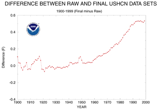
Consider, for example, the graph at the beginning of this post. It is produced from the data at the United States Historical Climatology Network (USHCN). The graph shows what you get when you subtract the raw data (what is actually measured) from the adjusted data (what is actually displayed) for several of the temperature stations in the network. If the adjustments had no overall effect on the trends given by the raw data, the graph should show a line that wiggles above and below zero. From 1900 to about 1940, that’s roughly what you see. During that time period, then, we can be fairly confident that the adjustments aren’t affecting the overall trend given by the data.
Notice what happens after about 1940, however. The difference rises significantly as time goes on. What does that mean? It means the adjustments are increasing the temperature data more than decreasing them. In other words, the adjustments are making the more recent years hotter than the raw data indicate they were. In addition, the more recent the year, the warmer the adjustments are making it seem. This, of course, is a troubling result. The USHCN’s data are often used to show that the average temperature of the U.S. has been increasing over time. However, if the above graph is accurate, at least some of that warming trend is not the result of actual measurements. It is the result of adjustments that have been made to the data.
Now please understand that the very nature of the USHCN makes adjustments necessary. The data come from a system of weather stations, and the problem with such a system is that every once in a while, there is a glitch. Sometimes, there is a power outage at a station. Sometimes, there is a communication error. Sometimes, the station is down for maintenance. As a result, there are times when the station doesn’t report any data at all. This would be a problem, because it would skew the data. To fix this problem, there is a computer code that estimates the temperature that the station would have sent if it had been sending data at the time. This is necessary to keep missing data from causing a problem, but if the estimate is severely wrong, the “fix” might be worse than the missing data.
If the graph at the top of this post is accurate, it seems to me that might be the case.
Continue reading “An Investigation of Temperature Data Adjustments”


