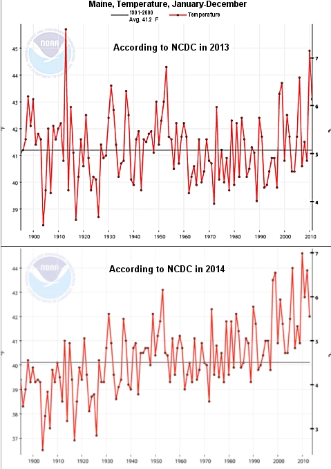
In 2013, certified consultant meteorologist Joseph D’Aleo was putting together a talk and wanted to show a graph that illustrated how the average temperature of the state of Maine had changed over time. He went to the National Oceanic and Atmospheric Administration’s (NOAA) National Climatic Data Center (NCDC) and downloaded the data. As shown in the top graph, the average temperature showed no trend (warming or cooling) for more than 100 years. This year, he was preparing a talk and wanted to update the graph. He went back to NOAA’s NCDC and downloaded the exact same temperature record, including more recent years.
The change was dramatic, as shown in the bottom graph. The data showed a clear warming trend. Was this dramatic changed caused by more recent years added to the new graph? No. It was caused by the old data! Between the times D’Aleo had downloaded the data, the temperatures for some of the previous years had been lowered, and the temperature for some of them had been raised. However, it seems that more of the earlier years were lowered and more of the later years were raised (or lowered less). As a result, the message of the graph had changed remarkably. Where just one year previously, the data showed no warming over the past century, that same data now show a significant warming trend over the exact same time period! As he states:
Does anybody know what the REAL temperature of Maine is/was/is supposed to be? I sure as [**BLEEP**] don’t. I don’t think NCDC really does either.
What caused Mr. D’Aleo to share this experience? It was a revelation that started with Steven Goddard (aka Tony Heller).
Continue reading “When it Comes to Temperature, You Might Not Be Able to Trust the Data!”

