Microscopic Analysis of Dinosaur Soft Tissue Casts More Doubt on Proposed Preservation Mechanism

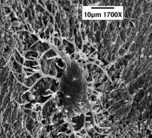
The dark mass near the center is the cell body of a dinosaur bone cell. The various “arms” extending from the body are its filipodial extensions. (click for credit)
I have written a lot about soft tissue found in dinosaur fossils and other fossils that are supposed to be millions of years old (see here, here, here, here, here, and here, for example). Right now, the best work being done on this issue comes from the Dinosaur Soft Tissue Research Institute, which is run by microscopist and young-earth creationist Mark Armitage. Without the help of government grants, he and his colleagues have produced some truly incredible work. Their latest contribution was published in Microscopy Today, and it strengthens the case that these fossils cannot be millions of years old. As always, I encourage you to read the article in its entirety, but here is my “color commentary.”

First, the article shows more incredible, delicate structures that would not be expected to survive any preservation process that would protect them for millions of years. For the first time in the scientific literature, there are two excellent pictures of dinosaur vein valves (Figures 2 and 3), features that are so delicate they are hard to extract from animals that have just recently died. In another first, he shows a nerve from the same fossil (Figure 6). In that nerve, you can see the delicate Bands of Fontana, structures that are unique to nerves.

He also shows a bone cell from the same fossil (Figure 7). While bone cells from dinosaur fossils have been published in the scientific literature, this particular one is very important. Bone cells have characteristic structures called filipodial extensions that are remarkably thin (widths of less than 200 billionths of a meter). The bone cell shown in their study has a filipodial extension that is 24 millionths of a meter long. That doesn’t sound like much, but it is about 30% longer than any other dinosaur filipodial extension found in the literature. This is important, because its length is more than 100 times its width. Think about a structure with those dimensions made out of soft tissue. It would be ridiculously fragile, yet there it is in a dinosaur fossil!

Second, and more importantly, he shows that the current explanation evolutionists have for the preservation of soft tissue in dinosaur fossils doesn’t work. Dr. Mary Schweitzer was the first to give strong evidence for the existence of soft tissue in dinosaur fossils, but she is committed to an evolutionary view. As a result, she needs to find an explanation for how such tissue could survive for millions of years. Seven years ago, she published a study in which she hoped to show that iron from the blood of a dinosaur could produce certain reactions that would preserve the tissues. I wrote about her explanation at the time and how it didn’t seem to make sense based on what we knew. Later on, better chemists than I wrote a detailed analysis about how her explanation is inconsistent with the data.

This new paper demonstrates rather conclusively that Schweitzer’s explanation doesn’t work for the fossil being discussed. Armitage and his colleague (Jim Solliday) search the filipodial extensions of bone cells that are found right outside a canal that held a blood vessel. Since the cells are so close to what was a blood vessel, and since the filipodial extensions are so delicate, those iron-induced reactions should produce noticeable effects on the filipodial extensions. He shows that those effects are not present. Thus, it is unlikely that such reactions happened at all in the fossil.

Also, in her study, Schweitzer took great pains to prevent blood clotting so that iron from the blood could be distributed throughout the soft tissue she was trying to preserve. However, Armitage and Solliday present strong evidence for massive blood clotting in their fossil. This would prevent iron from being able to promote any tissue-preserving reactions. While their evidence is strong, however, it is not conclusive. Thus, as they suggest, more research needs to be done.

The Dinosaur Soft Tissue Research Institute is on the forefront of this issue in science, and they are doing it without the massive government grants available to organizations who are desperately trying to fit the data into an evolutionary framework. If you have the means, I suggest that you make a donation to keep science progressing in this area.

A Journey from Judaism to Atheism to Christianity

Dr. Larry Kramer, PhD.
If you have been reading my blog for a while, you know that I collect stories of atheists who became Christians. This one is very interesting to me for two reasons. First, I know Dr. Kramer personally. He and I met several years ago at a conference that we both attend regularly. He was familiar with my books, so he introduced himself to me. I got to know both him and his wife, and we became friends. I always look forward to seeing them at the conference. Second, as the title indicates, atheism was more of a “transition point” on his journey. I have encouraged him to write about this for some time, and I am thrilled that he has. I hope you enjoy reading it:

My Journey from Judaism to Atheism to Faith

Regardless of What You Have Heard, the COVID-19 Deaths in the U.S. are Real

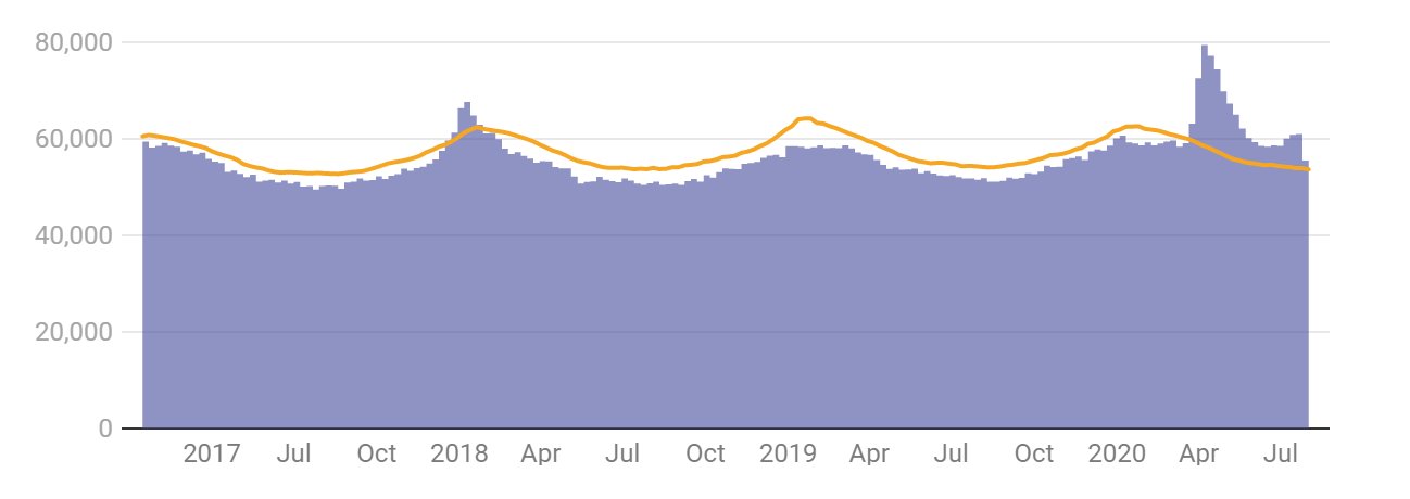
The purple bars are the deaths in the U.S. each week since2017. The yellow line represents the maximum number of deaths that were projected for those weeks. (graph by The Conversation, data from the CDC)

I have referenced this article in some comments I made previously, but I want to highlight it in a separate post, because the graph it contains (also shown above) makes it clear that the COVID-19 deaths are not some manipulation of the data. They are real. Very real. The purple bars in the graph represent all deaths recorded in the U.S. each week since 2017. The yellow line represents a projection of the maximum number of deaths that should have happened each week. The projection is based on historical data, and it fluctuates with the season. That’s because there are usually more deaths in the winter and fewer deaths in the summer, and as you can see, the actual deaths show that same fluctuation.

Notice that for most weeks, the actual deaths were lower than the maximum number of projected deaths. That’s expected. If the projection is done well, there should rarely be a time when the actual number of deaths meets or exceeds the maximum projection. However, there were some weeks in December of 2017 and January of 2018 when that happened, because there was a particularly virulent strain of the flu that season. As a result, more people died than were expected.

But those excess deaths are dwarfed by the ones that start showing up the last week of March in 2020. In that week, about 4,000 more than the maximum projected deaths occurred. Since then, the actual deaths have exceeded the maximum projected deaths by a considerable margin every week. All of this is discussed in the article from which I took the graph. However, I want to make a couple of additional points.

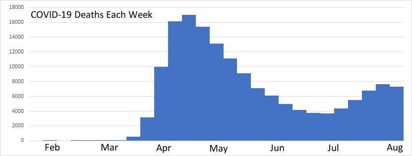
First, look at the shape of the excess deaths. There appear to be two peaks – one very large one the second week of April, and a smaller one at the end of July. This is important, because it looks very, very similar to the COVID-19 deaths reported over the same time span:

When the excess deaths have essentially the same time profile as the COVID-19 deaths, you know that the COVID-19 deaths make up most of the excess deaths. This tells us that the vast majority of COVID-19 deaths are real and most certainly represent people who would not have died had there not been the COVID-19 pandemic.

Second, some friends have asked me why they don’t know anyone who got the disease or died from it. After all, if there really have been more than 180,000 people who died from the disease and more than 6 million confirmed cases, shouldn’t everyone know someone who has suffered from it? Of course not! There are 328.2 million people who live in the U.S. That means about 2% of the population has contracted COVID-19, and about 0.05% have died from it. Thus, your chance of knowing someone who died from it is ridiculously low. While your chance of knowing someone who contracted it but didn’t die from it is significantly higher, remember that for most cases, the disease is mild. Thus, you would have to know someone well enough that you track his or her common illnesses to be aware that he or she had the disease!

It disturbs me that there are so many people (many of whom are Christians) who think this pandemic has been made up. The data clearly say that it hasn’t been. Lots of people died because of the disease, and misinformation will only increase the number of deaths. Now please understand that I am not saying that I support any of the measures that governments have taken to slow the spread. We don’t know enough about the disease or the consequences of the actions that have been taken to know whether or not they are a good idea. I said this before, and I will say it again:

As a scientist, let me assure you that no one really knows what we should be doing. There are a lot of experts saying a lot of different things, and you should listen to all of them. Then, you should decide what works best for you and your family, and you should start doing it. But once you decide what you and your family should be doing, please please please show grace to those who choose to do something different. Since the experts can’t agree on a proper course of action, there is no reason to expect your neighbor to agree with your course of action.

In addition to showing grace to others, please please please stop spreading the false idea that the COVID-19 deaths are few in number or not real at all. They are real, and there are a huge number of them. There is simply no other way to understand the data.

Please Stop Spreading False Information About COVID-19

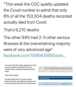
Falsehoods meant to downplay the seriousness of COVID-19 (click for an enlarged image)
On Saturday, I received the image on the left from a well-meaning individual. She wanted me to see that we have been fooled regarding the severity of the virus that causes COVID-19. By Sunday, this image (or one like it) was all over my Facebook feed. Please understand that the statement starts out as completely false and then uses true statements to imply something else that is completely false. Unfortunately, it tends to resonate with people who do not understand medical science and who have not been personally affected by the pandemic. As I watched this lie literally spread around the world, I couldn’t help but think of Jonathan Swift’s famous statement1

Falsehood flies, and the Truth comes limping after it.

Here is my attempt to get the truth to come limping after this falsehood.

Let’s start with the first lie. The CDC has not “quietly updated” the numbers to “admit” something. The CDC has been regularly updating the numbers in the same place since the pandemic began. In addition, they have been saying that 94% of COVID-19 deaths were in patients with underlying conditions since at least April 3rd. That’s nothing new to anyone who has done even a little investigation into the matter.

More importantly, this image is meant to imply that COVID-19 is not dangerous because the vast majority of people who die from it have some other illness. Once again, that is simply 100% false. If you look at the underlying conditions that are included in the 94% (table 3 in the link above), you find things like high blood pressure (hypertensive diseases), diabetes, obesity, etc. The image tries to categorize them as “serious illnesses,” and depending on the person, they might be. However, they are present in a large percentage of the population. 45 percent of adults in the U.S. have a hypertensive disease, 10 percent of the U.S. population have diabetes, and 42 percent have obesity. Thus, a huge number of people in the U.S. have at least one of the “serious illnesses” that make you likely to die from COVID-19. In other words, there are many, many people at risk of death from COVID-19.

But how can we say that these people died of COVID-19 when they had some other condition? Because most of these conditions are completely treatable and will not generally kill a person. However, when that person gets an infection, the underlying condition makes it harder for his or her body to fight off the infection, leading to death. The more serious the infection, the more likely the person is to die. In fact, the majority of people who die of an infection like influenza, pneumonia, tuberculosis, etc. have an underlying condition that makes it more difficult for them to fight off the infection. Thus, it is not even remotely unusual that 94% of people who die from COVID-19 had one or more underlying conditions. It is common for many serious infectious diseases, especially in the developed world.

There is one more issue in the image above that I must address. It says that the overwhelming majority of people who died from COVID-19 were of advanced age. That’s true, but it’s true for all deaths in the developed world, not just COVID-19 deaths. Indeed, a recent study compared the ages of people who died from COVID-19 to those who died from all causes. Guess what? They were quite similar:

In fact, the age distribution of deaths attributed to COVID-19 is quite similar to that of all-cause mortality, which tends to increase by about 10% every year of age after age 30 y.

We don’t know a lot about COVID-19, and there is no way to scientifically state the best cause of action against the disease at this time. However, we do know that it is a very serious disease, and it is being downplayed by some using falsehoods like the image above. Please stop the misinformation! If you want to share something about COVID-19, at least make sure it doesn’t communicate something blatantly false, like the image above does.

ADDENDUM (added 9/4/2020): Someone on a friend’s Facebook feed wrote an incredibly insightful comment that I must share. She said that if you really think that the only COVID-19 deaths are the ones that had COVID-19 as the sole cause, then you must think that AIDS has a mortality rate of zero!

REFERENCES

1. The Examiner, Number 15 November 2 to November 9, 1710, (Article by Jonathan Swift), Page 2, Column 1, Printed for John Morphew, near Stationers-Hall, London.
Return to Text

What Have Government Restrictions Accomplished with COVID-19?

Cumulative COVID-19 cases (left) and deaths (right) per million in Sweden and Denmark
(click for a larger view)

In a previous post, I compared COVID-19 cases and deaths in Sweden and Denmark. As I said then, it’s because they are very similar countries in the same basic region of the world, but they have remarkably different responses to the disease. Sweden has avoided lockdowns and tried to target their social restrictions, while Denmark has followed the practices of most other countries, strongly limiting what their citizens can do during the pandemic. While no comparison of two different countries is conclusive, I think the results are very interesting. The data come from the European Centre for Disease Prevention and Control, and while it may very well be a biased source of data, at least it is equally biased for both countries.

The graph on the left shows the cumulative COVID-19 cases per million. That means each day on the graph shows the total cases that were reported by that date, divided by the population in millions. Initially, Denmark had more cases (probably because initially they were testing more), but as you can see, Sweden quickly surpassed Denmark in cases per million, and the difference between the two countries has continued to grow. Since the death rate of COVID-19 is low (but higher than most infectious respiratory diseases), many people (including myself) think that death rate is a better indicator of the severity of the pandemic. Thus, the graph on the right shows the cumulative deaths per million. Notice that Sweden has more than 5 times the deaths per million as Denmark.

If the comparison between these two countries is legitimate, then, government restrictions did reduce the number of COVID-19 deaths per million in Denmark. However, there are those who suggest that this might be okay, since Sweden will reach herd immunity faster than Denmark. In the long term, then, Sweden will have fewer COVID-19 deaths because the spread of the disease will stop sooner.

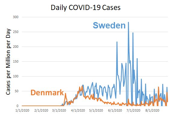
Based on my evaluation of the data, I don’t think Sweden is significantly closer to herd immunity than Denmark. Take a look at the graph below, which records cases per day per million. Rather than adding all the cases reported by a given date (as is done in the graph on the left above), this shows the daily reports of COVID-19 cases per million.

If Sweden were closer to herd immunity than Denmark, the recent cases per million per day in Sweden should be lower than the cases per million per day in Denmark. However, they are not. For most of August, Sweden and Denmark have roughly equivalent cases per million per day. That tells me the disease is spreading roughly the same in the two countries right now, but Sweden has lost five times the people (per capita) as Denmark. As a result, my analysis indicates that Denmark’s restrictions kept a lot of people from dying of COVID-19, and that will continue to be the case in the long run.

Now please understand that this analysis considers only deaths from COVID-19. We know that government restrictions have also caused deaths. There are those who say that the government restrictions will cause more deaths than the ones that were saved from COVID-19. Others say that overall, the restrictions have saved lives. I think the data are insufficient to make that determination, but I do agree that most countries are ignoring the devastating death toll caused by the restrictions themselves. Nevertheless, I think the data are now clear that Sweden’s strategy has not accomplished what the country had hoped it would.

Another Possible COVID-19 Treatment

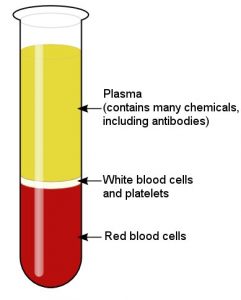
The three components of blood (click for credit)
So far, there are no widely-accepted treatments for COVID-19. Hydroxychloroquine, often mixed with other things like azithromycin, was initially thought to be promising, but the data so far are inconclusive. While there are some indications that it is effective (and some physicians are convinced it works very well), the controlled studies that have been done so far see no significant benefit to its use. The antiviral drug remdesivir shows some promise, as does the corticosteroid drug dexamethasone. However, there are not enough data yet to make a firm decision on either of them.

Yesterday, President Trump held a press conference to announce a new possible treatment: convalescent plasma. Based on an analysis of several different studies, it seems to be the best candidate yet (in my non-medical-doctor opinion). I say this because of the kinds of studies that have been done. First, there have been three randomized clinical trials. This means patients were assigned to either get the treatment or not get the treatment based on random chance. The group that got the treatment was compared to the group that didn’t (called the control group). In the three studies, the death rate in the treatment group was half that of the control group. There were also five matched-control studies, where the treated patients were compared to a control group specifically selected to closely match them. The results of those studies were similar to those of the randomized clinical trials. There were also four case-series studies, where patients were given the treatment and their progress was tracked. While that kind of study has practical uses for physicians, its ability to determine the effectiveness of a treatment is extremely limited. However, the case-series studies seem to support the other two kinds of studies. All of the studies were done on patients with severe or life-threatening cases of COVID-19.

Taken all together, then, the treatment looks very promising. However, I do have to say that each study was very small, so even when all the patients were analyzed, the total number was only 804. Phase three clinical trials that determine whether or not a drug should be widely used typically involve a few thousand patients. Thus, this is still a limited data set. Also, many of the studies (as well as the analysis linked above) are not peer-reviewed. As a result, there could be major flaws that have not been noticed. A recent analysis (once again not peer reviewed) of more than 35,000 patients seems to support the small studies, but since it has no control group, it cannot be used to draw any real conclusions. Nevertheless, the FDA has approved emergency use of the treatment, and it is asking those who have recovered from the disease to help in determining whether or not it is truly effective.

How can someone who has recovered from COVID-19 help determine the effectiveness of the treatment? To understand that, you need to learn a bit about the wonderful mixture that is running through your circulatory system.

Continue reading “Another Possible COVID-19 Treatment”

Forbes Tells You Not To Think For Yourself

I have written about a couple of instances where Forbes has censored articles because they disagree with the “scientific consensus” (see here and here). As a result, it didn’t surprise me to find that they are now actively trying to discourage people from thinking for themselves. This discouragement comes in the form of a blog article written by Dr. Ethan Siegel, who holds an earned Ph.D. in astrophysics. It is entitled, “You Must Not ‘Do Your Own Research’ When It Comes To Science”.

Dr. Siegel believes that in order to assess any scientific statement, a person must have some expertise in the relevant field. Otherwise, the person’s “research” will only end up confirming what he or she already wants to believe. He writes:

It’s absolutely foolish to think that you, a non-expert who lacks the very scientific expertise necessary to evaluate the claims of experts, are going to do a better job than the actual, bona fide experts of separating truth from fiction or fraud. When we “do the research for ourselves,” we almost always wind up digging in deeper to our own knee-jerk positions, rather than deferring to the professional opinions of the consensus of experts.

He backs up this anti-science view by giving examples of how people deny the scientific consensus on issues like fluoridated drinking water, vaccination, and global warming (aka climate change). He then relates it all to the current pandemic. He says that rather than listening to the experts and obediently following whatever they tell you to do, some people are actually looking into the matter for themselves, and the results are devastating.

Continue reading “Forbes Tells You Not To Think For Yourself”

Another Exciting Development in COVID-19 Prevention

AeroNabs could be delivered as a nasal spray. (click for credit)
Scientists are pursuing several different strategies to protect people from the virus that causes COVID-19, and a recent paper that hasn’t been peer reviewed reports on a strategy I haven’t seen before. It makes use of the fact that the virus starts the infection process by employing specific chemicals called spike proteins to bind to an enzyme (ACE2) in human cells. The idea is simple: Block the virus’s ability to bind to that enzyme, and it will be unable to start the infection process. But how can that be accomplished? In the paper, the researchers report on making a small molecule, called a nanobody, that binds to the spike proteins on the virus. Once the nanobody binds to them, the spike proteins can no longer bind to the ACE2 enzyme.

First found in alpacas, nanobodies are like antibodies, but they are smaller, simpler molecules. Because of that, they are easy to make and manipulate. Essentially, scientists can build a small gene that produces the nanobody, insert it into certain microorganisms, and let the microorganisms churn out the nanobodies. As a result, there have been many, many different kinds of nanobodies produced over the years. The researchers searched a database that contained more than two billion nanobody genes, and they found 21 that should be able to bind to the virus’s spike proteins in some way. They put those genes into yeast, extracted the nanobodies that were produced, and studied them.

Based on their analysis, they found the three most promising candidates and tested them against the virus itself. One of the nanobodies was particularly effective, so they focused on it. They mutated the gene multiple times to make slight changes to the nanobody and tested the result against the virus. They then produced a gene that could take the three most effective nanobodies and chain them together. The result was a chemical that basically shut down the virus’s ability to infect human cells.

Continue reading “Another Exciting Development in COVID-19 Prevention”

Why Are Children Less Susceptible to COVID-19?

Children make up less than 2% of all identified COVID-19 cases. This is unusual, since they make up 20-30% of influenza cases. Why is COVID-19 so much rarer in children? A study from the Icahn School of Medicine at Mount Sinai Hospital in New York might have found the answer. Cells found in the nose, lungs, veins, and other parts of the body sometimes have an enzyme called ACE2 in their membranes. The enzyme is important, because it can participate in a process that lowers blood pressure when necessary. Studies show that the virus which causes COVID-19 (SARS-CoV-2) attacks cells by attaching to that enzyme.

The researchers examined nasal tissue from people between the ages of 4 and 60. The tissue collection had already been done between 2015 and 2018 for a research study on asthma. The researchers specifically looked at how much the gene that makes ACE2 was expressed. The more the gene is expressed, the more ACE2 is made. They found that the youngest children expressed the gene the least, older children expressed it more, young adults even more, and older adults even more. Thus, the younger you are, the fewer ACE2 proteins in the cells that line your nasal cavity, so the fewer places the virus has from which to attack. As a result, the less likely you are to be infected.

Because of the nature of the original study for which the tissue was collected, nearly half of the people from whom the tissue came had asthma. Also, they didn’t have tissue from anyone over 60 years of age. Thus, the sample is not truly representative of the nation as a whole. Nevertheless, the results are very intriguing, and they seem to explain why this respiratory virus affects children differently from most common respiratory viruses.

Please DO NOT Get Your COVID-19 Information from Social Media!

So far, I have written three articles about how horrible social media is as a source of scientific information (see here, here, and here). Facebook might be a great way to find out what your friends are eating, but it is one of the worst places you can go to learn about science, especially the COVID-19 pandemic. That’s because lots of people (left, right, and center) have decided to politicize the pandemic, and the unscrupulous among them have transformed science from its true nature (a very imperfect mode of inquiry) into a weapon. Unfortunately, many people don’t recognize weaponized science, and as a result, they tend to share things that fit their political views, regardless of whether or not they are accurate.

Consider, for example, the statement shown above. I have seen it on my Facebook feed at least a dozen times. While the statement is factually accurate, it supports a false narrative. Yes, there have been roughly 4 million cases of COVID-19 in the U.S. so far, and there were estimated to be 60 million cases of H1N1 during the 2009 pandemic. So the H1N1 pandemic of 2009 was “worse” than the COVID-19 pandemic today. Therefore, all the precautions we are taking against COVID-19 (shutting down schools, wearing masks, etc.) are just a result of politicians trying to use the current pandemic to their advantage. Of course, that’s simply not true. The reason we are taking precautions against COVID-19 is that it is significantly more deadly than H1N1. Out of the estimated 60 million cases of H1N1 in 2009, there were only about 12,500 deaths. Out of the roughly 4 million cases of COVID-19, there have been almost 150,000 deaths. Since 15 times fewer cases have produced more than 10 times as many deaths, it is easy to understand why we are taking more precautions against this virus!

Just to give you one more example, yesterday I saw this statement on my Facebook feed:

The COVID-19 death rate without a vaccine is lower than the flu death rate with a vaccine.

As far as I can tell, there is no way you can massage the data to make that statement even factually correct. For the 2018-2019 flu season, there were estimated to be more than 35.5 million cases and 34,200 deaths. Once again, for the current COVID-19 pandemic, there have been roughly 9 times fewer cases, but about 5 times as many deaths.

Now please understand that I am certain the number of COVID-19 deaths are being overreported. But they aren’t being overreported to the point where you can conceivably compare this current pandemic with the H1N1 pandemic of 2009 or the seasonal flu. In the same way, I know that politicians are using this pandemic to their advantage, but that doesn’t mean it isn’t real and isn’t serious.

So when it comes to getting information about the pandemic, choose your sources wisely, and do not include social media on the list!