68% of the Universe May Not Exist!

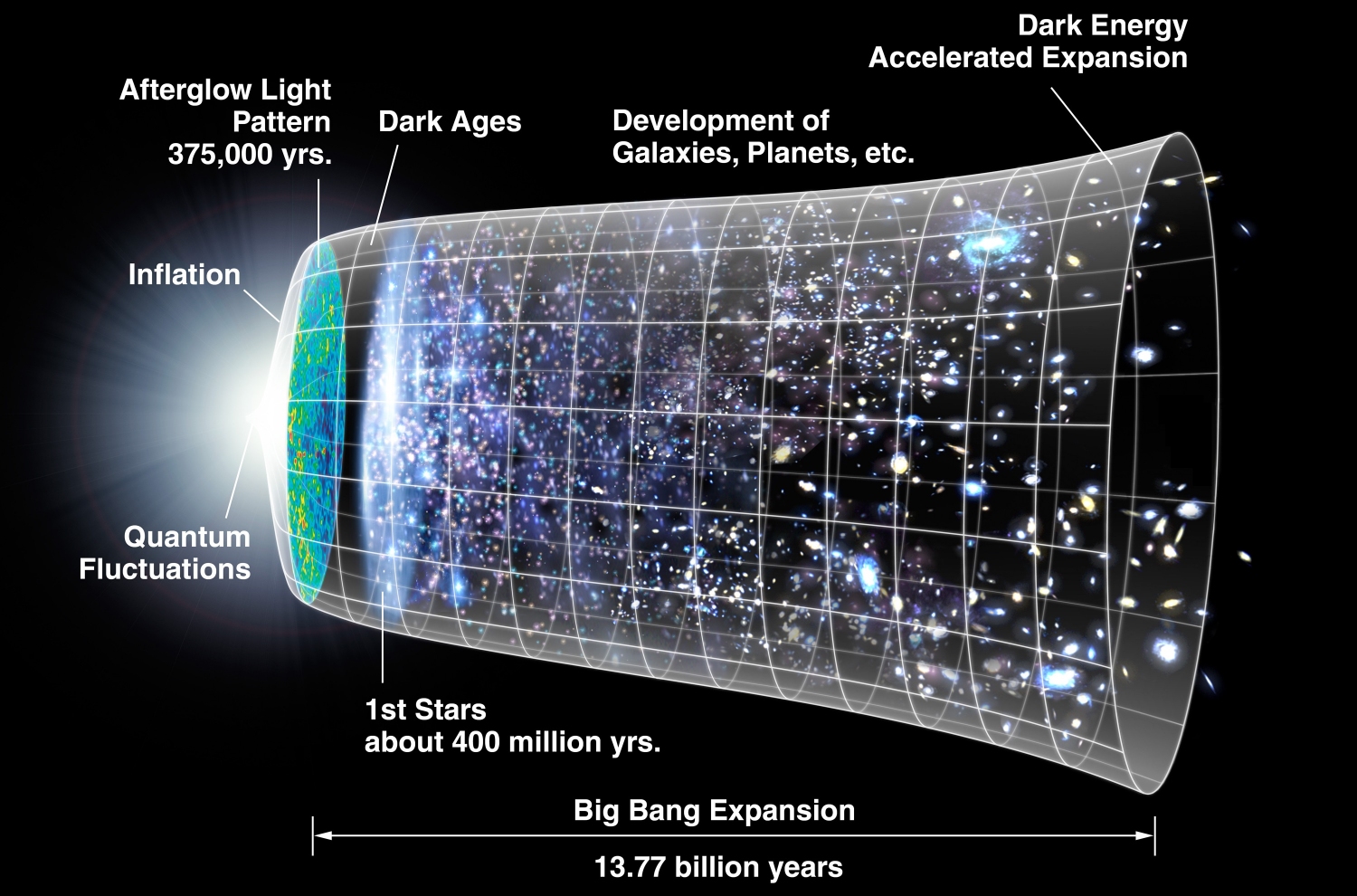
The history of the universe, according to the standard model of cosmology (click for credit)

Unsuspecting students are often taught “facts” that are anything but actual facts. Consider, for example, what NASA says about the nature of the universe:

It turns out that roughly 68% of the universe is dark energy. Dark matter makes up about 27%. The rest – everything on Earth, everything ever observed with all of our instruments, all normal matter – adds up to less than 5% of the universe. Come to think of it, maybe it shouldn’t be called “normal” matter at all, since it is such a small fraction of the universe.

What is this thing called “dark energy” that supposedly makes up more than half of the universe? NASA honestly says that no one has any idea. However, NASA assures students that we know that 68% of the universe is made up of it.

Of course, what NASA (and most astrophysicists) neglect to tell students is that the entire existence of dark energy, including its amount in the universe, is based on a myriad of assumptions, some of which are almost certainly not true. Nevertheless, they assure students that they know dark energy exists and that most of the universe is made up of it. The cold, hard truth, however, is that everything we know about dark energy is based on models, and those models are built on assumptions. If the assumptions are wrong, the models could be wrong, and if the models are wrong, the whole idea of dark energy could be wrong.

This issue was brought front and center with the recent publication of a paper that challenges one of the assumptions that is instrumental in the conclusion that dark energy exists. If the results of this paper are confirmed, dark energy will be thrown into the same trash bin as phlogiston, luminiferous ether, and the impossibility of quasicrystals.

Continue reading “68% of the Universe May Not Exist!”

Once Again, Don’t Get Your Science from Facebook!

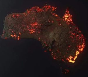
A visualization of the Australian fires that have happened recently (by Anthony Hearsey and Creative Imaging: click for more info)
I have made two posts so far cautioning people to be very skeptical of science-related Facebook posts (see here and here). In general, you should be skeptical of anything on any social media site, but science is easily skewed and misrepresented, especially when people are trying to show their own virtue by championing some cause.

One case in point comes from the Australian bushfires that are wreaking havoc throughout the country. My Facebook feed recently showed me the image you see on the left. The person posting wanted to make me aware of how devastating the bushfires in Australia have become, so he posted this picture. While it does indicate an incredible level of devastation, it isn’t really true. There are two problems with the image. First, it looks like a satellite photo that is showing the fires burning right now, but it is not. It is an image that was developed on a computer, and it doesn’t show how Australia is burning right now or at any other time in the past. Each “flame” in the image represents a fire that burned sometime this season. In other words, it shows any region of Australia that had a fire this season, but it shows that region as on fire right now. In fact, many of the fires depicted on this image have been extinguished.

There is a bigger problem that is common with all visualizations of this kind. When you make an image like this, you need to add “fire” in the region where there is or was a fire. However, the image represents something very, very large. Suppose there was a fire that burned three square miles. That’s a big fire, but in this image, it would be represented by a red dot that is one millionth the size of the image. Thus, it wouldn’t show up. In order to make it show up, you need to make it bigger. However, that makes it look like more than three square miles were burned.

This issue is called “gridding.” When dealing with a large object, it must be partitioned into small sections by drawing a grid. If the sections in your grid are very large compared to the areas that you are depicting, the resulting depiction is deceptive. So, in fact, even considering all the fires that have happened so far this season (extinguished or not), they haven’t covered as much of Australia as the “flames” on this map.

Now don’t get me wrong. I am not saying that the fires in Australia are nothing to be worried about. They most certainly are devastating! They probably represent the worst bushfires in the past hundred or so years. That’s a bit hard to tell, because some of the most devastating fires in Australia occurred in the past, when news coverage wasn’t very good. We know, for example, that in 1851 widespread bushfires killed at least 12. In 1939, bushfires killed at least 71. While it does look like the current bushfires are burning a larger area than any of the previous ones, it is hard to say that with certainty. Regardless, the image above definitely overstates their severity.

Continue reading “Once Again, Don’t Get Your Science from Facebook!”

Science and Creativity, Part 2

Click for credit

In my previous post, I shared a very creative lab report that I received from a physics student in one of my online physics courses. In this one, I want to share something from another very creative student. In order for you to appreciate it, however, a bit of background is necessary.

In my online courses, students take tests online while being supervised by their parents. The parent has a passcode for each test, and when the student is ready to take the test, the parent inputs the passcode into a website. This opens up the test for the student to take. Some of the test questions are multiple-choice (I call them “multiple-guess”), some are true/false, and some are short answer. That, however, is not enough to fully assess a student’s knowledge when it comes to science, so I also have a few “essay” questions on the tests. In physics and chemistry, they are usually long, involved problems that the student must work out.

In order to properly assess the student’s work, I must see all the steps that the student takes to come up with the answer. If the student were taking the test on paper, that would be fairly easy. The student could just write out the equations being used, show how the variables were plugged it, and go through whatever algebra is necessary. However, on a website, that can be tricky. The program we use has an editor that allows the student to write equations, but it is bulky and cumbersome. Student can do their work on paper and then upload an image of the paper, but that is also bulky and cumbersome. As I result, I simply tell students to explain the steps they took to get to the answer, and I allow them to use any method they think bests accomplishes this goal. Some use the equation editor, some use paper and upload an image, some give equations using just text, and some give me a narrative of what they did.

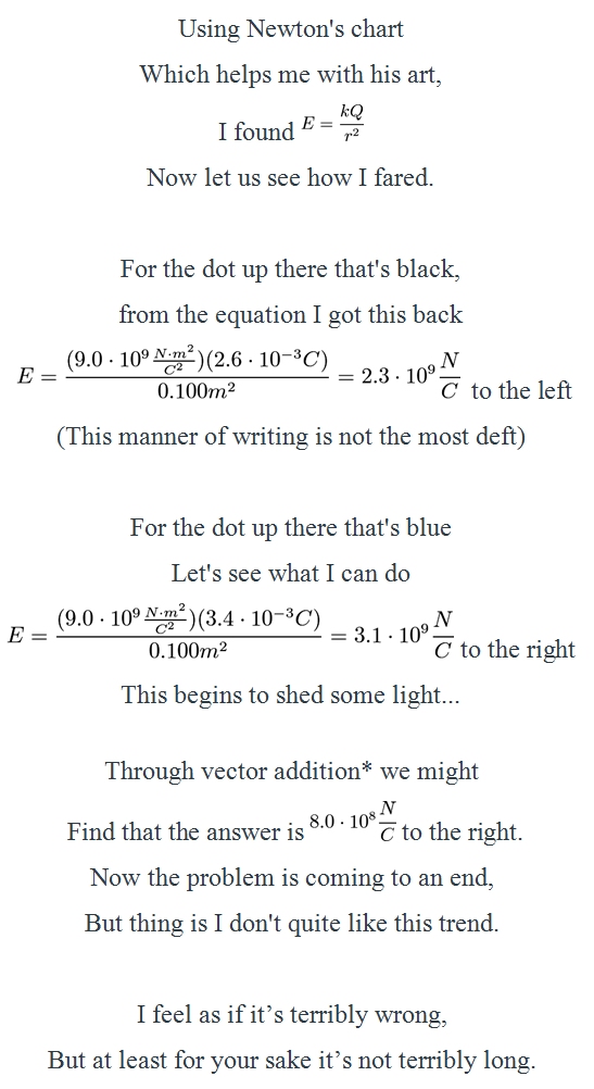
Eden Cook is an example of the latter. She gives me a narrative of her work, usually in the form of an amusing story. There are typically characters in her stories, and they each have their own personality, which adds to the humor. One of those characters is “Newton.” Well, in one question where she had to determine the electric field produced by two stationary charges (represented by one one black dot and one blue dot), she decided to forgo the story and write a poem. I.T. W.A.S. E.P.I.C.

(The star is a footnote where she shows the vector addition, and her answer was correct.)

Science and Creativity: Part 1

Click for credit

If you have been reading my blog for a while, you know that science is not my only interest. I write plays, perform in plays (musicals and non-musicals), and play the piano. When people who don’t know me well find out about these interests, they are sometimes surprised. They wonder how a scientist could possibly have a creative side. I have always been puzzled by the idea that science and creativity are incompatible. Science, by its very nature, is creative. I know lots of scientists who can write amazing poetry, play an instrument beautifully, sing a song magnificently, or perform onstage like a professional. However, none of my acquaintances from the arts can solve a differential equation, analyze the motion of a body that is influenced by friction, or synthesize a chiral compound from nonchiral components. In my opinion, science and creativity simply go together.

That’s why I love it when students decide to be creative with their assignments. I have two examples of this, which will take up two blog posts. They both come from the online physics courses I taught the previous academic year. In those courses, students must write lab reports, and I grade them. I don’t have the students write a hypothesis, discuss materials and methods, and all that nonsense. That makes no sense when it comes to a laboratory exercise, and it doesn’t really prepare the student for university lab reports. Instead, I have them write out their data, do any calculations that are necessary, and then write a summary of what they did and what they can conclude from their results. The summary and conclusions must be in their own words.

In honor of my love of the theater, one student (Riley Harro) wrote his last experiment summary and conclusion as an audition, and it was stellar! It contains a lot of inside jokes that resulted from the discussions we had in class and the common phrases I use while teaching. To give you some context, the lab is about testing materials to determine whether or not they are ferromagnetic, paramagnetic, or diamagnetic. In the end, the nail is ferromagnetic, the aluminum paper clip is paramagnetic, and the matchstick is diamagnetic. I hope you enjoy his report as much as I did:

Continue reading “Science and Creativity: Part 1”

Why You Must Read Multiple Opinions When it Comes to Evolution

I ran across an old article by Dr. David Berlinski. He is one of the more interesting proponents of intelligent design, since he does not believe in God but nevertheless thinks the natural world is obviously the result of design. In addition, he is an entertaining writer whose keen wit and disciplined thought help him cut to the heart of the issues about which he writes.

The entire article is worth reading, but for the purposes of this blog post, I will just give you the “executive summary.” The eye has always been a problem for flagellate-to-philosopher evolution. Not only does it seem so obviously designed, but developing an evolutionary history of the various eyes we see in nature has led to the incredible conclusion that eyes must have evolved independently in multiple evolutionary lineages. Nevertheless, those who fervently believe in evolution as a creation myth are convinced that it must have happened somehow. As a result, they tend to jump on anything that might support their fervent belief.

Enter Dr. Dan-Eric Nilsson and Dr. Suzanne Pelger, who published a scientific article entitled “A Pessimistic Estimate of the Time Required for an Eye to Evolve.” In this article, they sketch what they think might be a path by which a small circle of light-sensitive cells surrounded by a dark pigment and covered with a protective layer of tissue might evolve into a camera-type eye. In a series of eight drawings that they came up with in their own minds, they show how that circle of light-sensitive cells might form a depression, add a lens, and eventually come to resemble some of the eyes that we see in nature.

They measured four aspects of each drawing and assumed that those aspects could each change by 1% for every evolutionary step that was taken towards the next drawing. In the end, they estimated that it would take 1,829 steps to get from the first drawing to the last one. Using a simple equation that tries to estimate how many generations it takes to produce each evolutionary step, they arrived at the conclusion that it would take only 363,992 generations to get the job done. Since some organisms with eyes have generations that last a only a year, they suggest that in some cases, eyes could evolve in a mere 363,992 years.

Continue reading “Why You Must Read Multiple Opinions When it Comes to Evolution”

Once Again, Don’t Believe Facebook When It Comes to Science!

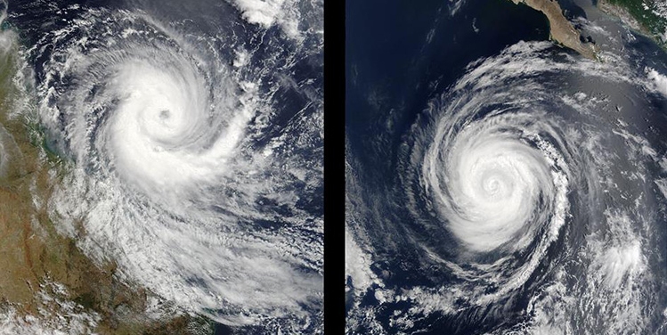
Cyclone Larry near northeast Australia (left) and Hurricane Hernan near Mexico (right). Notice that the rotation in the Southern hemisphere is clockwise, and the rotation in the Northern Hemisphere is counterclockwise.
(Images Courtesy of NASA/GSFC, by Jeff Schmaltz and Jacques Descloitres)

A few months ago, I posted an article about how you should not believe Facebook memes and videos when it comes to science. Of course, I have seen more scientific nonsense on Facebook, but lately the following video keeps popping up on my feed:

When I see it, I generally comment that the video is a clever con. It is based on a scientific concept that is quite true, but it does not apply to situations that involve short distances. Most of my Facebook “friends” express appreciation for me pointing out the error, but one of them was adamant for a while that the video shows a real truth. In my efforts to educate him, I ended up finding a really nice video resource, which I will share after my long-winded statements on this issue.

Continue reading “Once Again, Don’t Believe Facebook When It Comes to Science!”

Please Stop Believing Facebook, Especially When It Comes to Science!

A picture from a high school experiment that has been hyped on Facebook.

As I was scrolling through Facebook, finding my historical twin and learning what my friends are eating, I noticed a post on my wall. It was from someone I know only through Facebook, but I read her work from time to time, because she is a really good writer. Her post contained the picture above and linked to an article entitled, “WiFi Experiment Done By A Group Of 9th Grade Students Got Serious International Attention. THIS Is Why…” She asked if I knew whether or not the results were legitimate.

The experiment went like this: Students took 12 trays of cress seeds and put 6 of them in one room and 6 in another room. The six trays in one room were next to two WiFi routers, while the 6 trays in the other room were nowhere near a router. They tried to keep everything else (temperature, amount of water given, etc.) the same for all 12 trays. The article says:

After 12 days what the result spoke was clear: cress seeds next to the router did not grow, and some of them were even mutated or dead.

Obviously, then, WiFi routers produce something that kills (and apparently mutates) cress seeds.

I told my Facebook friend that the post reminded me of something that was popular a few years ago. It was an experiment where a person watered a plant with regular water and watered another plant with water that had been in a microwave oven. After several days, the one watered with microwaved water died, while the other one flourished. Obviously, then, microwave ovens are bad for you. Of course, the heart of science is being able to replicate experiments, and many people found that they couldn’t replicate the reported results. Indeed, the Mythbusters did an episode showing that microwaved water didn’t harm plants in any noticeable way.

Continue reading “Please Stop Believing Facebook, Especially When It Comes to Science!”

Debunking the Myth That Copernicus “Demoted” the Earth

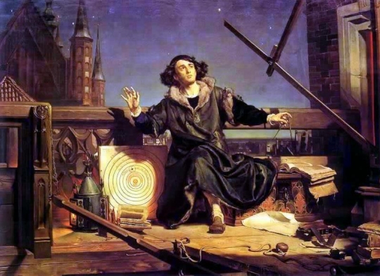
Jan Matejko's painting entitled, "Astronomer Copernicus, or conversation with God."
Jan Matejko’s painting entitled, “Astronomer Copernicus, or conversation with God.”

It is a common statement made in many discussions of how Copernicus revolutionized our understanding of the universe. Goethe’s quote is a typical example:

Of all discoveries and opinions, none may have exerted a greater effect on the human spirit than the doctrine of Copernicus. The world had scarcely become known as round and complete in itself when it was asked to waive the tremendous privilege of being the center of the universe.

If you read one of my previous blog posts you will recognize one myth in that quote. People knew the earth was round long, long before Copernicus. Indeed, by 200 BC or so, the distance around the earth had been measured.

There is, however, another myth in the quote. Do you see it? It is the myth that the ancients put the earth at the center of the universe to indicate how important humanity is and that Copernicus “demoted” the earth and humanity’s importance by taking the earth out of that center. While this myth is commonly taught wherever Copernicus’s revolution is discussed, it is quite false.

Continue reading “Debunking the Myth That Copernicus “Demoted” the Earth”

Debunking the Flat Earth Myth

This painting depicts Christopher Columbus kneeling in front of Queen Isabella.

Since today is Columbus Day, I thought I would discuss a myth commonly associated with the man. I learned it in school, as did many others. It’s the myth that people in Columbus’s day thought the earth was flat. Highlights of American History Before 1850, for example, tells students about a conversation that supposedly took place between Christopher Columbus and Queen Isabella:1

“Your Highness,” said Columbus, “instead of going east across the land to reach India, your traders can sail west across the ocean.” “What? Are you mad?” asked Queen Isabella. “If they sail too far west they will fall off the edge of the earth!”

A more recent book puts it this way:2

Only 500 years ago, sailors aboard the Santa Maria begged Columbus to turn back lest they sail off the Earth’s “edge.”

There is a big problem with such pronouncements: no historical evidence exists to back up the idea that most people (even uneducated people) in Columbus’s day believed the earth was flat. In addition, there is a wealth of evidence that indicates no one took such an idea seriously.

We know, for example, that philosophers understood the spherical shape of the earth long before Christ was born. It was discussed by philosophers like Pythagoras in the fifth century BC3 and became widely accepted when it was championed by Aristotle (384–322 BC). He saw that the stars were different in one part of the world than the other. This indicated to him that the earth must be a sphere.4 The spherical shape of the earth was so widely accepted among philosophers that Eratosthenes (c.276–c.195 BC) used the change in a staff’s shadow resulting from a 500-mile trip to measure the circumference of the earth. He was correct to within less than 2% of today’s accepted value.5

Continue reading “Debunking the Flat Earth Myth”

For Some Diseases, It Was Vaccination, Not Sanitation

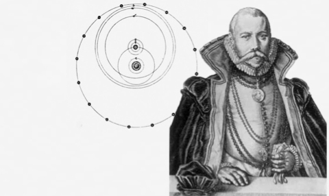
This is the logo of Project Tycho.  It depicts Tycho Brahe with his unique view of the universe. (click for credit)
This is the logo of Project Tycho. It depicts Tycho Brahe with his unique view of the universe.
(click for credit)

Dr. Wilbert van Panhuis and his colleagues have started an exciting initiative called Project TychoTM. In it, they are taking public health data that have been collected over the years and putting them into an easy-to-access digital system that is open to everyone. They describe the goal of their project in this way:

We aim to advance the use of public health data for the improvement of public health. Oftentimes, restricted access to public health data limits opportunities for scientific discovery and technological innovation in disease control programs. A free flow of data and information maximizes opportunities for more efficient and effective public health programs leading to higher impact and better health. Our activities are focused on accelerating the availability and use of public health data…

They named the project after Tycho Brahe, one of the more colorful 16th-century astronomers. Not only did he live an interesting life, he had a very interesting view of the universe. He made an enormous number of astronomical observations that he meticulously documented, and those observations convinced him that the planets must orbit the sun, not the earth. However, he couldn’t give up the idea of the earth being at the center of everything, so he produced what is probably the most interesting view of the universe ever. As shown in the logo above, he put the earth at the center of the universe, and he had the sun and moon orbiting the earth. The rest of the planets were then assumed to orbit the sun, as it moved in its orbit around the earth. While this view of the universe is clearly unworkable, it was incredibly original!

Why would a project involving public health data be named after this colorful character? Because his main contribution to science was the data he collected. While he couldn’t make heads or tails of his data, another astronomer, Johannes Kepler (who was once employed by Brahe) did. Kepler was able to use Brahe’s data to develop three laws of planetary motion that demonstrated all the planets, including the earth, orbit the sun. Sir Isaac Newton was then able to use Kepler’s Laws to develop his Law of Universal Gravitation, which describes how gravity works both here on earth and throughout the universe. Brahe’s data, then, were the foundation of some of the greatest advancements in the field of astronomy in the 16th and 17th centuries.

In Dr. van Panhuis’s view, the data he is collecting could end up being like Brahe’s data. It might be used by other scientists to better understand diseases and how to deal with them as they spread through populations. While I can’t say whether or not that will ever happen, I can say that these data make it easy for me to address a popular myth about vaccination.

Continue reading “For Some Diseases, It Was Vaccination, Not Sanitation”